
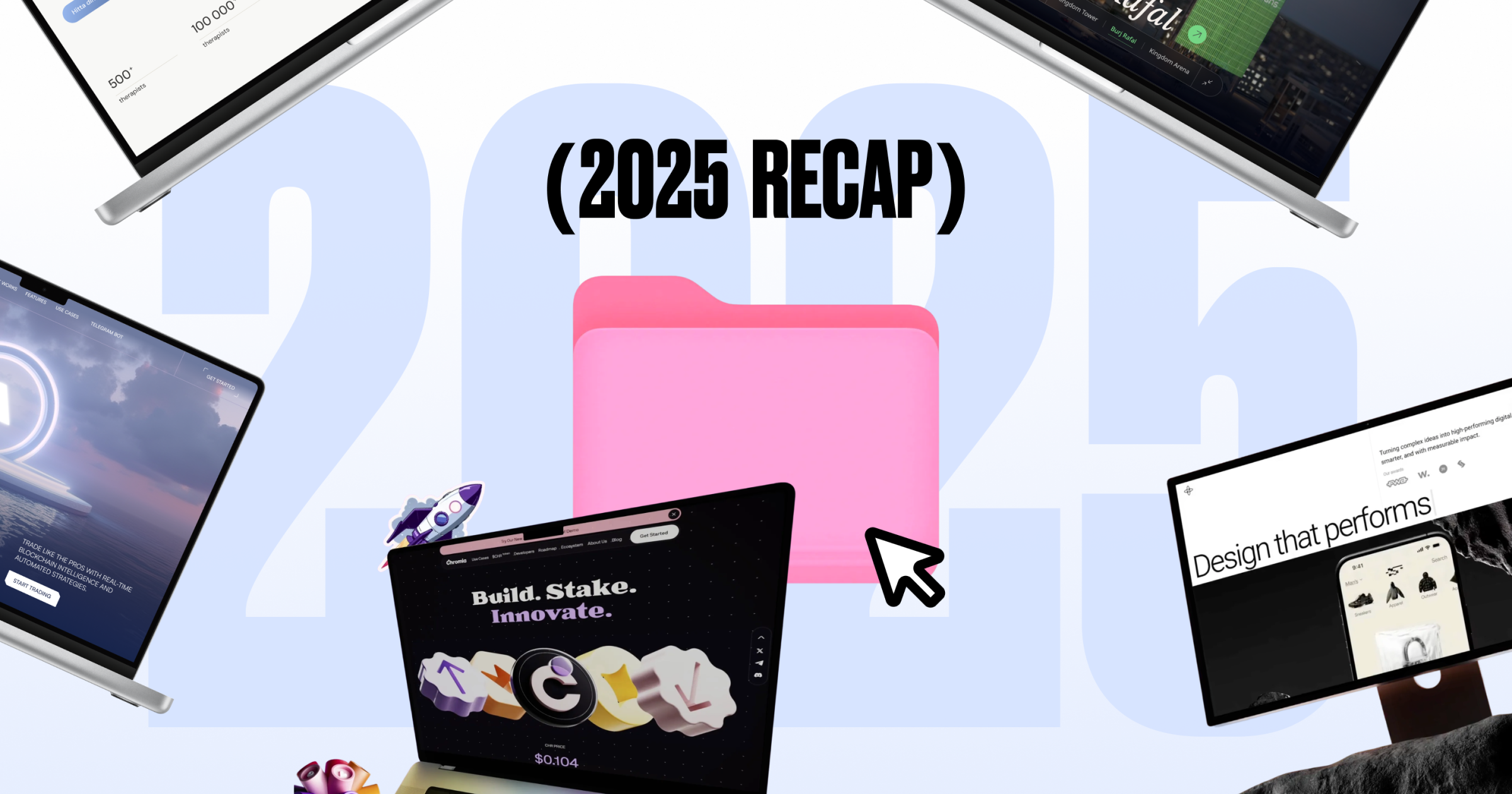
A short design recap from our team
At some point towards the end of the year, we at Sigma Software Design did a small retro inside the team. Nothing formal. No slides. Just a shared doc, a few screenshots, and a lot of “oh right, this one!”
We looked at the projects we’d shared publicly over the year, the ones we’d spent time refining, arguing over, polishing, sometimes rethinking entirely. When we put them all next to each other, the mix was broader than we expected.
- Web3 and blockchain products.
- AI and infrastructure platforms.
- Analytics, fintech, adtech, B2B websites.
- Healthcare and wellness.
Different industries, very different constraints. Some projects had been with us for years and went through another round of refinement. Others needed a clearer structure, a stronger visual language, or simply more confidence and scale.
What felt consistent wasn’t the type of work, but how we approached it. Making complex things easier to read. Letting mature products look mature. Knowing when to be restrained and when visuals should carry weight.
We decided to share that short internal recap. Partly to sum things up for ourselves. Partly in case it’s useful or inspiring for anyone working on similar products.
This isn’t everything we worked on, just a few highlights. Some projects are under NDA, and some need a bit more time. You’ll probably see them in 2026.
Web3, blockchain & infrastructure
A good example of long-term work is Solidus AI Tech. This isn’t a product that appeared and disappeared within a single year. What we shared recently reflects a more mature stage of the platform. Over time, the focus shifted away from adding and towards removing. Tightening structure. Calming the visuals. Making sure the interface communicates power without noise.
A lot of the work lived in small decisions that don’t draw attention to themselves but add up quickly when they’re missing.
The visual below shows a Marketplace page design, a small part of the overall work for Solidus AI Tech.
With Tenderly, the logic was similar, but the constraints were different. Developer tools don’t reward expressive design. They punish it. The interface has to stay predictable, readable, and slightly boring in the best possible way. Most of the progress here came from subtle adjustments — hierarchy, spacing, rhythm — the kind of things users don’t notice unless they’re gone.
With Chromia, the focus shifted toward how the product feels. The goal was to show that a Web3 brand doesn’t have to feel distant or overly serious. Together with the Chromia team, we worked across brand identity, 3D visuals, website design, merch, and marketing materials. The direction ended up bold and playful, but still grounded. What we like about this project is how naturally it balances ambition and approachability — and how clearly it shows that blockchain can feel creative, human, and open.
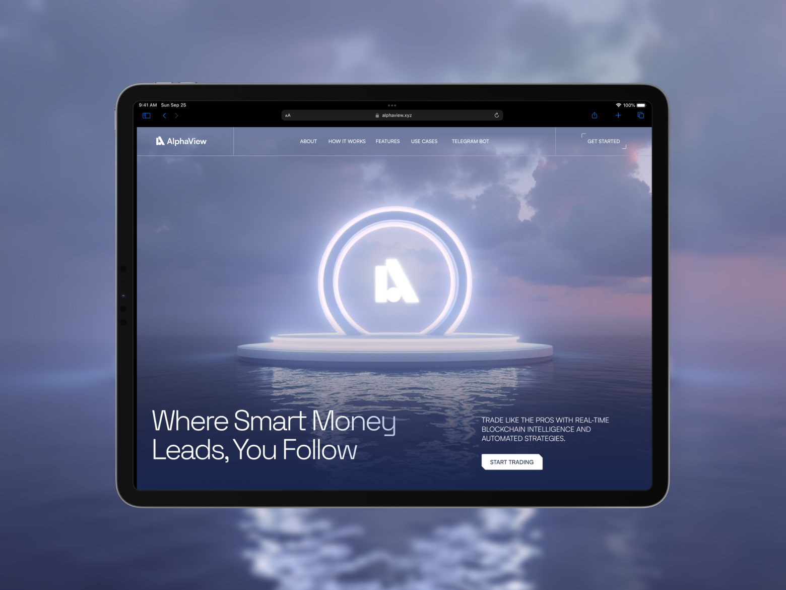
Products like HyperFlow and Alpha View live in environments where people read dense information and make real decisions. Here, design earns its place through pacing and clarity. The goal isn’t to decorate complexity, but to help users move through it without second-guessing themselves.
Healthcare & wellness
Healthcare work asks for restraint. The design shouldn’t impress, it should reassure.
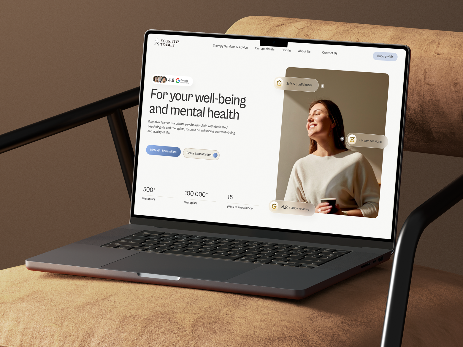
That was the focus with Kognitiva Teamet, a Swedish psychotherapy and mental health practice. The website needed to feel calm, clear, and trustworthy at first glance. Most of the work lived in tone, spacing, and structure choices that don’t call attention to themselves, but matter when people are making very personal decisions.
B2B, adtech & consulting platforms
Not every product benefits from pulling back. Some reach a point where presence matters.
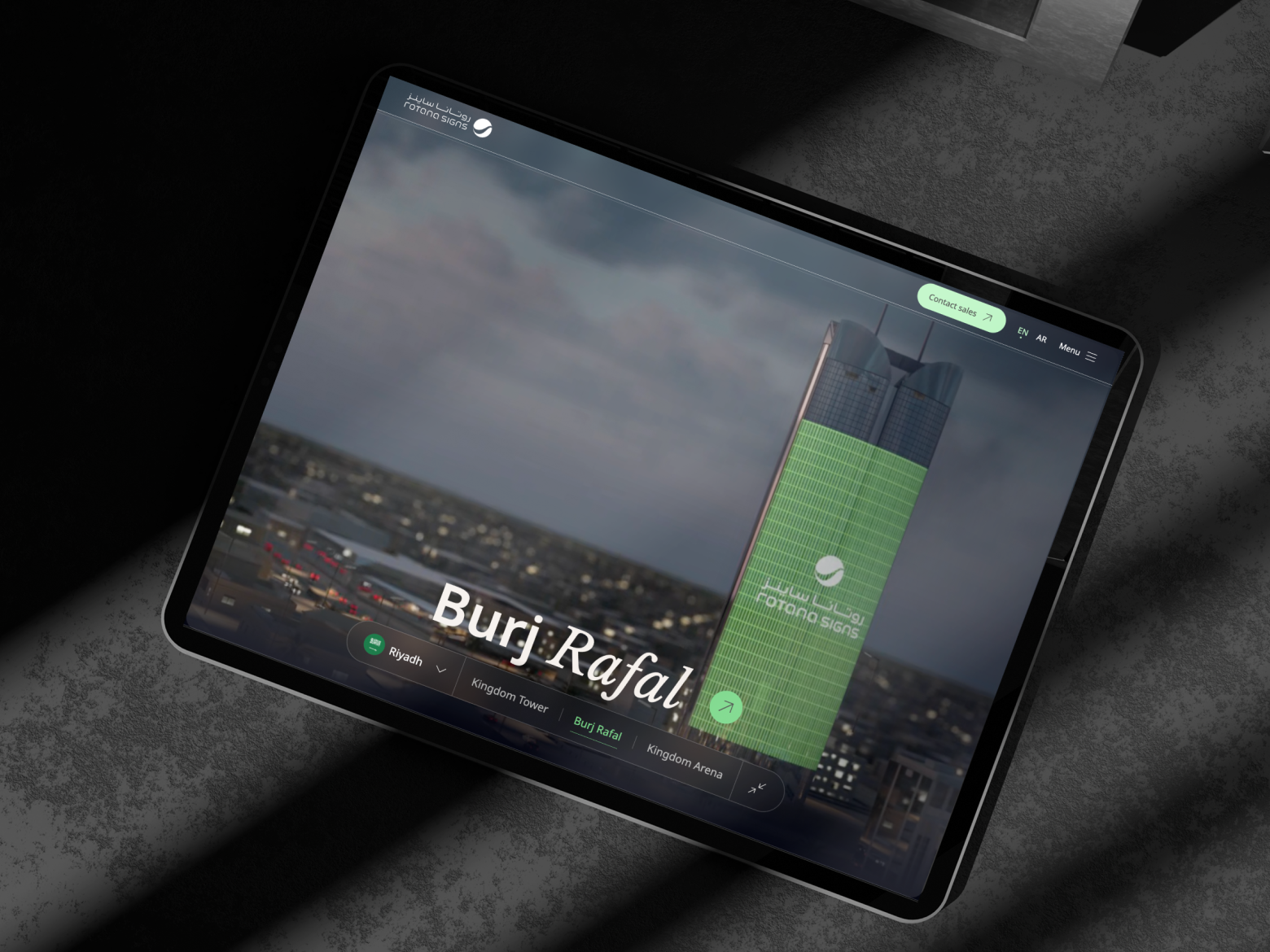
That was the case with Rotana Signs. This project leaned heavily into visuals and scale. We spent a lot of time on composition, imagery, and proportion making sure the digital presence actually reflects the company’s real-world capabilities. The risk was overdoing it. The work was in finding confidence without chaos.
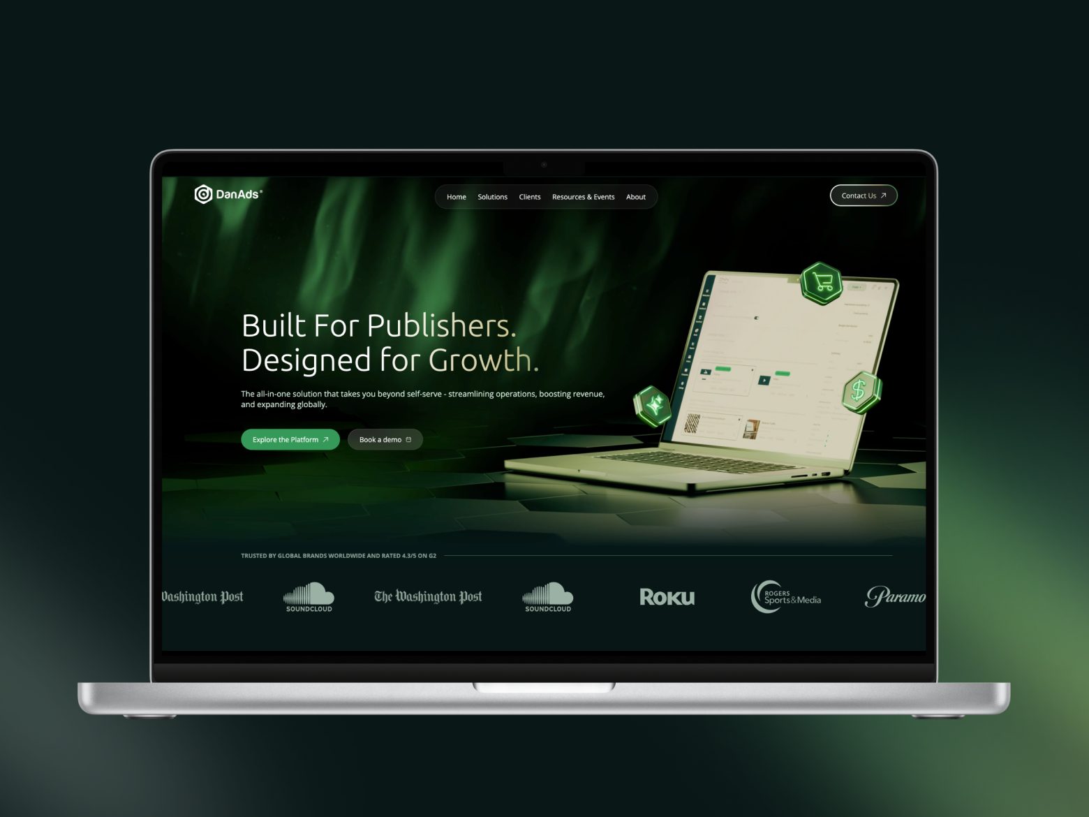
With DanAds, the decision went the other way. The product is complex, established, and operationally dense. Abstract visuals didn’t help. What worked was showing the platform honestly: real screens, real flows, minimal framing. Sometimes quality shows up as accuracy.
Experiments & internal projects
Some of the work we did this year doesn’t fit neatly into product categories, and that’s probably why it sticks with us.
The DeLorean conference project for Sigma Software wasn’t meant to explain anything. It just needed to be recognizable, a little playful, and good at starting conversations. The tricky part was knowing how far to take it, where it’s still fun, and where it would start to feel forced. As with most things, the work was in stopping at the right moment.
Around the same time, we found ourselves looking at our own website and realizing it no longer quite matched how we work today. Not in a dramatic way, more like that quiet feeling that something is slightly off.
So the redesign of the Sigma Software Design website happened gradually. No big relaunch energy. Just familiar questions we usually ask clients: what actually needs to be here, what can go, and what no longer reflects how things work now. We moved things around, cut more than we added, and had the same debates we’ve had a hundred times before, only this time, with ourselves.
And maybe that’s where this recap naturally lands.
Because behind all of these projects: client work, internal work, experimental pieces… there was a lot more than visuals. There was research. UX decisions. Development trade-offs. Performance constraints. Accessibility considerations. Real users with real habits and very little patience for things that don’t work.
Creative ideas matter. But they only hold up when they’re grounded in how products are actually used.
Looking at this selection now helps us see that more clearly. Different industries, different problems, but a familiar way of thinking. Making complex things easier to read. Letting mature products look mature. Being honest about when visuals should speak louder, and when they shouldn’t.
That’s what this recap is.
A snapshot of the work we shared. And a small pause to notice what we’ve been building thoughtfully, and together.
See you in 2026!
%202.webp)

.webp)

.png)