How we helped a growing low-code platform make a complex editor easier to understand and easier to scale.
Growth usually brings “more” into a product: more features, more use cases, more user roles, more edge cases, and more decisions the interface has to support, which is a natural part of becoming more capable but can eventually expose the limits of a structure designed for an earlier stage.
That was exactly the situation we found in this project, where our client’s low-code workflow automation platform had matured significantly over time and the experience had gradually become more demanding to navigate as new functionality was added.
The project is under NDA, so we cannot show original screens or disclose specific product details, but we can share the thinking behind the work, the patterns we found during the review, and the structural decisions that helped make a complex professional tool easier to understand and easier to extend.
The context
Users work in a visual editor where they build business processes, configure settings, validate their work, and execute resulting workflows. As more functionality appeared, it naturally found its place within an existing interface, which meant that using the platform increasingly required knowledge about how different parts of the system were connected.
For people who work with a product every day, this kind of complexity can be difficult to notice because they already know where settings live, which controls belong together, and what will happen after each action, while a new or less experienced user has to learn those relationships through the interface itself.
From a business perspective, this affects much more than usability because harder onboarding, weaker feature discoverability, more explanation from support or product teams, and increasingly difficult roadmap decisions often grow from the same underlying issue.
Our work therefore started with a broader question than whether individual screens could be improved: does the interface still reflect how the product actually works today, and can that structure continue supporting where the business wants to take it next?
Looking beyond individual UX issues
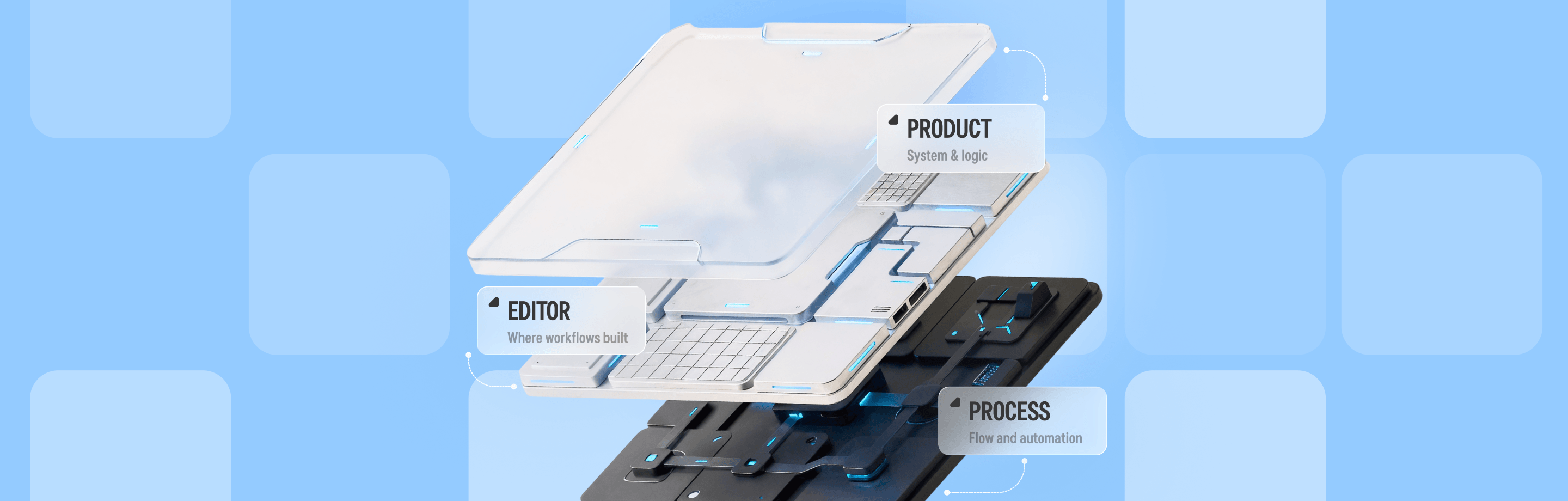
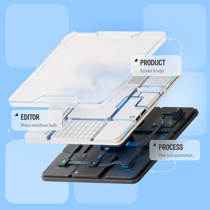
At first, we were dealing with several practical concerns that seemed relatively independent, including settings that looked global even though they belonged to one process, a toolbar that had accumulated controls with very different purposes, new auto-save and validation states that needed somewhere to live, and upcoming functionality entering a navigation system that was already carrying quite a lot.
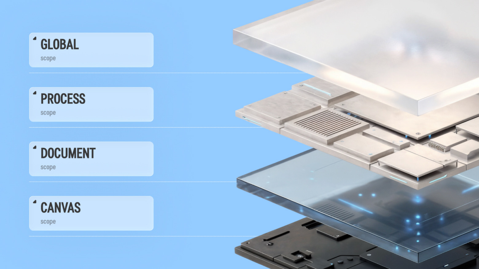
Once we looked at these concerns together, we started seeing the same issue behind them: users could interact with several different levels at once, including actions that affected all processes, one specific process, the document being edited, or simply the way its canvas was displayed, but those distinctions were not always visible enough in the interface.
Execution showed this especially clearly because it lived inside navigation for the active process, which naturally suggested that everything on the page related to that process, while a dropdown on the same page also allowed users to select any other process in the system and configure or run it instead.
There was a completely valid product requirement behind that behavior, since users genuinely needed access to launch settings across multiple processes, but combining process-level and cross-process functionality in one place made scope harder to read than it needed to be.
Constants showed a similar pattern because it appeared as an independent area even though its content depended on whichever process was currently open, which reinforced our feeling that solving each screen separately would only address the symptoms.
Building around a clearer hierarchy
We used one principle to guide further decisions: where something lives should help users understand what it affects, which gave us a much clearer way to organize both existing functionality and anything still to come.
General settings and cross-process launch configuration moved into a persistent product-level area, where their global scope becomes easier to understand, while navigation for an opened process now contains only functionality related to that process, including Editor, Execution, Business Case, and Constants.
Execution still supports running and configuring the active workflow, while cross-process configuration remains available at a higher level, which means users keep the same capabilities without having to interpret two different scopes inside one page.
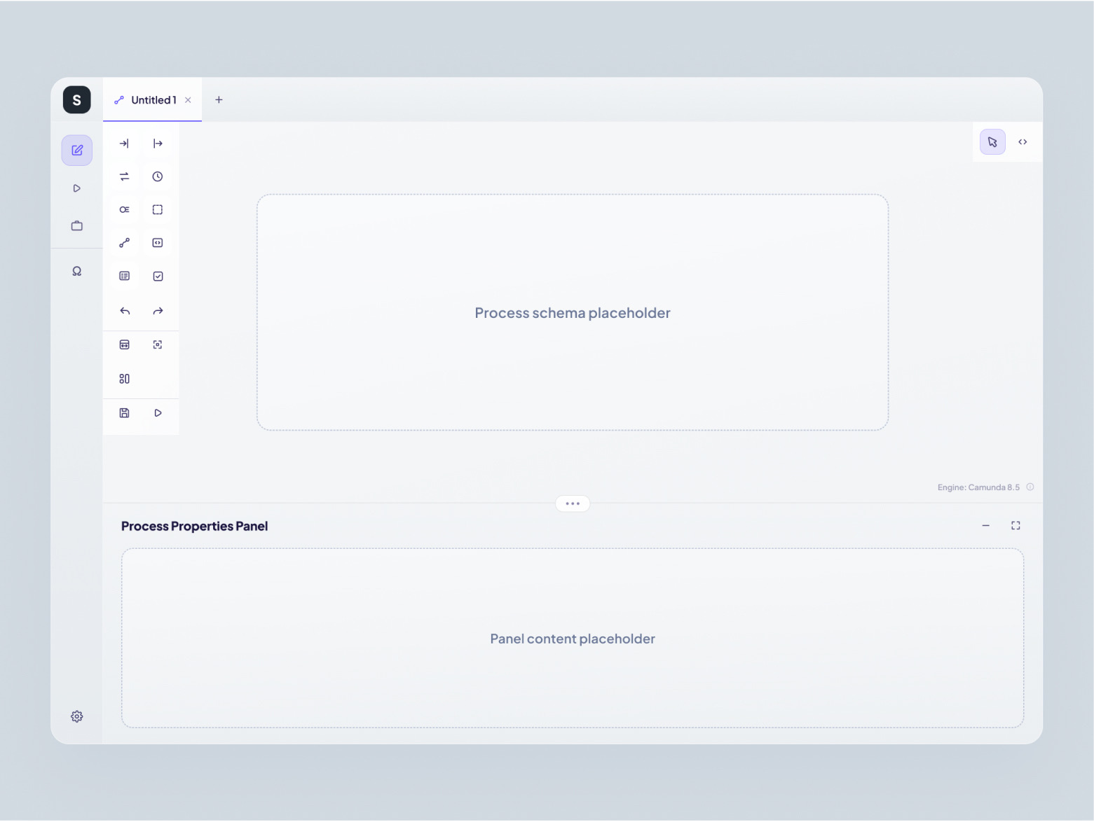
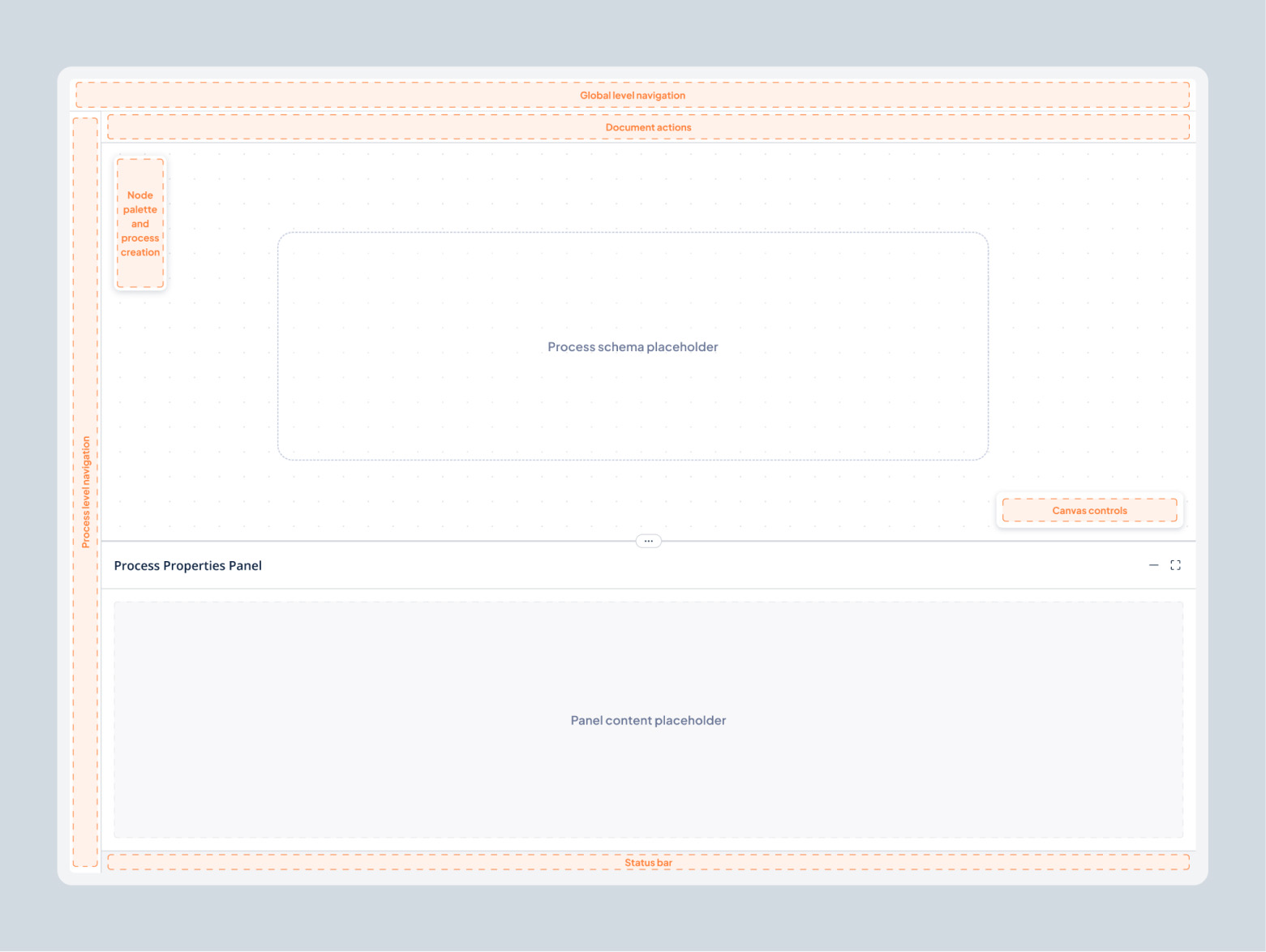
We followed the same logic inside the visual editor, where one toolbar had gradually become home to node creation, canvas navigation, undo and redo, saving, validation, execution, and several other controls that no longer shared a clear responsibility.
Rather than extending that toolbar again, we separated responsibilities into a few clear areas:
• Document actions such as undo, redo, save, validate, and switching between canvas and code remain in the top bar.
• Process creation and the node palette live in a dedicated left-side panel.
• Canvas controls such as fit to screen, center view, and auto-layout have their own floating group.
• System status is shown separately at the bottom of the workspace.
This made each part of the editor easier to interpret while keeping the overall interaction model familiar, which was important because the goal was to clarify how an already complex tool works rather than force users to relearn it.
We also kept manual Save and Validate actions even where automation handles those tasks in the background because users of professional tools still need the option to act deliberately and confirm that important work has been saved or checked.
Auto-save and auto-validation introduced another useful question around system feedback, because users needed to understand what was happening automatically without turning an already busy toolbar into a mix of controls, settings, and status indicators.
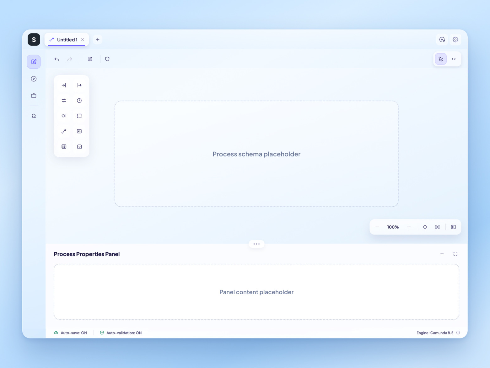
We solved this with a dedicated Status bar that shows auto-save and auto-validation state, process engine information, and validation issues, while configuration for those behaviors remains elsewhere in settings.
A lightweight indicator on the process tab also shows when changes are waiting to be saved, which keeps important feedback visible without adding more prominent controls to the workspace.
A structure that could handle what came next
The value of the new hierarchy became especially visible when the team introduced Business Case, a simplified process view where users define how end users will experience a workflow, including its steps, actions, and messages.
In the previous structure, a feature of this size could easily have triggered another discussion about where it should fit, while the updated model already gave us a clear answer because Business Case belongs to an active process and could naturally sit alongside Editor, Execution, and Constants while following the same page pattern.
For us, this was an important sign that the work was solving more than the current list of UX issues, because a strong product structure should reduce the number of decisions a team has to reinvent every time new functionality enters the roadmap.
What changed and why it matters for business
The final structure gave the platform 2 clearly separated interaction levels, organized the editor around 3 responsibility areas, and introduced 1 dedicated Status bar for auto-save, auto-validation, engine information, and validation issues. Manual Save and Validate remained available, and 0 existing capabilities had to be removed to make the experience clearer.
The new hierarchy also proved useful straight away when Business Case was introduced, because the team already had a clear place for the feature and a page pattern it could follow instead of reopening the navigation model again.
From a business perspective, these changes give both users and the product team a clearer framework to work with:
• For users, scope becomes easier to understand, which reduces the amount of product knowledge needed to work confidently with complex workflows.
• For product teams, new features can be placed according to an existing logic rather than becoming another one-off UX decision.
• For the roadmap, growing functionality no longer has to mean growing interface confusion at the same pace.
• For the business, this creates a stronger foundation for onboarding, feature adoption, product development, and future expansion without simplifying capabilities that customers already rely on.
This is also the point we would pay attention to in other mature B2B products: when new functionality keeps arriving but every addition makes navigation, settings, or toolbars harder to organize, the issue may already sit deeper than an individual screen. A UX review can help uncover whether the product has simply accumulated interface friction or whether its structure itself needs to catch up with how the business and product have grown.